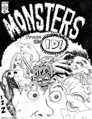
What is a comic jam, you may ask? Well, picture a "jam session" with a group of musicians, everyone playing off of one another and improvising around a common theme. Now instead of musical instruments, imagine that activity with cartoonists using ink and paper to create a finished comic book. That's a comic jam. Locally, jams are organized by the Cartoonist Conspiracy. They are a great way to keep in practice, meet other cartoonists, and have an outlet for experimentation and creativity in a low-pressure environment. They don't always end up making a lot of sense, but they're always a lot of fun.
Here is a link to the most recent jam I participated in back in May. The theme for this edition was "Monsters From The Id". (my contributions appear on pages 2,3,4,7,and 11... see if you can tell which ones are mine!)
Tuesday, July 26, 2011
Friday, July 22, 2011
Mullet River
A while back, musician Jack Norton asked me to help design some characters and a logo for a bluegrass musical act he was developing known as Mullet River. Eventually the Mullet River concept morphed into something else and we did not end up using these designs, but I thought I would share them here since I thought they turned out so well.
All images in this post are Copyright/Trademark - The Zinghoppers Group.
Mullet River logo featuring Curly Mullet - the background evokes flowing water and sheet music patterns.
Master character design for the Mullet River mascot Curly Mullet, our banjo playing fish friend.
Grandpappy Norton, a wise and jovial old barn owl.
Grandma Norton, a boisterous yet kind lady barn owl.
Monday, July 18, 2011
Drawing Words & Writing Pictures: Final Project
For our final assignment in Drawing Words & Writing Pictures, our task was to create a fully finished one-page story. I chose to do this whimsical, yet slightly dark "snowman hunter" idea that has been kicking around in my head for a while. It was inspired by a mini-comic I made earlier this year about a snowman who refuses to accept his fate as winter draws to a close (I will probably scan and post that mini on here sometime) Doing the lettering was a challenge for me, as always, but I am pretty happy with the art, especially the use of dramatic shadows and the characterization of the sad, dying snowman. This class was a total blast, and I hope you enjoy reading my work as much as I did creating it!
Update: Here's a link to Jessica Abel's blog post with an overview on the class: http://dw-wp.com/2011/07/five-day-comics-workshop/
Friday, July 15, 2011
Drawing Words & Writing Pictures: Imageless Comic
Another challenging exercise we did in class was to create a one-page comic story with no images - just sound effects and word balloons against a black or white background, using the absence of images as a factor in the story. The purpose of this was to make us focus strictly on the storytelling and layout, and not to get hung up on the art. My classmates came up with a number of intersting solutions to this challenge, such as a story set during a power outage, a conversation between characters in the woods at night, and a particularly moving tale told from the point of view of a blind person. My story portrays a pretty common morning scenario from my everyday life... (I don't think this one displays very well in the blog post, don't forget you can always click on the image to see it in a bigger size)
Thursday, July 14, 2011
Drawing Words & Writing Pictures: "Gag" Strip
This past week I've been taking an intensive, 5-day version of the Drawing Words and Writing Pictures cartooning course with Jessica Abel. It's been a fantastic opportunity to learn some new skills and dust off some old ones. I thought I would share a few our the exercises that I've done in class. One of the first things we did was to create a simple thumbnail sketch of a "gag" style comic strip, so we could discuss things like pacing, storytelling clarity, etc. Using the feedback I got from our critique, I later went ahead and worked this crude sketch into a final version. Mainly, I did that as an excuse to practice my nib-pen inking techniques. I will post more class exercises on here soon, so stay tuned!
The original crude thumbnail. The basic idea is there, but Jessica and the other students suggested I flip the clown in panel 3, so that you see his juggling action before he delivers the punchline.
The final version. Is the punchline funnier this way? Also, I added a framed photo on the wall to give the second clown's space more personality, and I experimented with using both upper and lowercase lettering as opposed to my usual all-caps style. Overall, I think it works (even though it's quite corny).
Monday, July 4, 2011
For Our Grandchildren
A couple years back, I got to try my hand at some political cartooning doing some illustrations for the non-profit group For Our Grandchildren, which was trying to raise awareness to the underlying problems with our social security retirement fund - most specifically, the fact that it is running out of money! Not sure if my little doodles helped shape any public policy, but here are a few of my favorites from that collection (I'll probably share a few more in a future post):
Subscribe to:
Posts (Atom)